What is Mobile-First Design and Why Google Prioritizes It

Mobile traffic accounts for 59% of the total internet traffic, and yet most of the business organizations continue to develop mobile-second and desktop-first. This mistake is costing you user actions, conversions, and search views.
The solution? Mobile first design method, which means beginning with the smallest screens, and focusing on the most essential material and navigation, and then proceeding to the larger screens. The change not only enhances the UX but also future-proofs your site, as your competitors are still stuck in the pattern of desktop-first thinking.
But what are the technical specifications to ensure a mobile-first design? The article will equip you with all the knowledge you need to create a mobile-first design, including the concept and the procedure.
What is Mobile First Design?
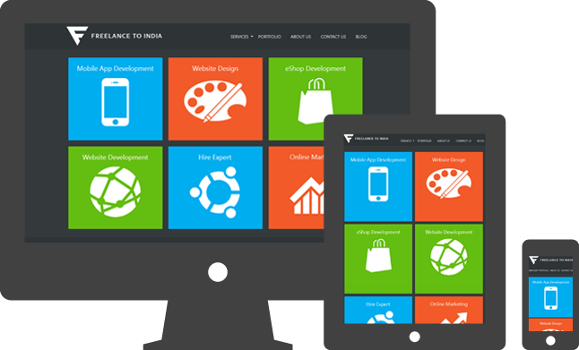
One of the methods of design is mobile-first design, whereby the design process of any given site is initially considered in relation to the mobile devices with small screen sizes, and the way the user interface will work on the mobile devices.
What Does Mobile First Design Mean?
Mobile-first design is the process by which the essential information and functionality required by users of mobile devices are identified, tailored to a specific user, setting, and behavior. To build wireframes of a prototype site, it is essential to start with the smallest screen size and consider the content hierarchy to create a mobile-first website.
Ensure that the UI of the site prioritizes accessibility to the most essential features and content, particularly on smaller screens. This is an incremental process of working on small-screen to large-screen site design, functionality features, and the complexity of layouts. This is unlike the conventional approach, where sites are typically first created to be desktop-compatible.
Mobile-First vs. Traditional Desktop-First Approach
This is a comparative analysis of the mobile-first concept and the traditional desktop-first concept.
| Aspect | Mobile-First Approach | Desktop-First Approach |
|---|---|---|
| Design Start | Starts with mobile screens and expands design for larger devices. | Begins with desktop layouts and adapts for other screen sizes later. |
| Content Focus | Emphasizes key content first, adds more as space allows. | Displays complete content from the start with full visual details. |
| Performance | Prioritizes fast loading and efficient performance | Designed for performance-rich visuals suited to desktop hardware. |
| User Interaction | Tailored for touch inputs and compact, easy navigation. | Built for mouse, keyboard, and detailed interface interactions. |
| Development Style | Follows progressive enhancement approach; start small and add features as you scale up. | Takes a “top-down” approach; designing fully for desktop, then adjusting if needed. |
| Design Philosophy | Focuses on clarity and simplicity for better mobile usability. | Offers flexibility and freedom in layout and content presentation. |
| Best For | Ideal for audiences primarily accessing through mobile devices. | Best suited for desktop-heavy tools, dashboards, or business platforms. |
Technical Foundations of Mobile-First Design
Implementing a mobile-first design requires a team of developers and designers to adopt the lean concept. At the beginning of the project, the team is small and grows in size over time. The team first concentrates on basic content and features. It is designed to meet both the need for a short loading time and enhance the user experience on mobile devices. Businesses looking for a professional approach can leverage specialized web design services to create a seamless, performance-optimized mobile experience.
Following key steps are involved in building a mobile-first design framework.
-
Mobile-First Wireframing and Prototyping
The first thing is to develop a wireframe sketch indicating the structure of the site layout. When creating this wireframe, the designers must consider the key content. The team would need to take into account the size of a small screen and concentrate on the content needed that would prompt user navigation.The mobile-friendly navigation should be planned. Speaking of the wireframe of the simplified navigation, it would be more relevant to make use of a hamburger menu or a bottom navigation bar.
-
Flexibility, responsiveness of layouts
After approving the prototype, have a flexible grid program to fit the layout in bigger screens. Relative units, such as percentages, em, or rem, may be used as an alternative to fixed pixels for padding. It assists in resizing web design features in varying screen sizes. These are additional guidelines to consider when creating responsive layouts.
- Install your typical CSS and add the minimum-width-media queries to the CSS so that you can add bigger-screen formatting and layouts when they are necessary.
- Flexbox should be used in case of one-dimensional layout, and CSS Grid should be used in case of two-dimensional layout.
-
Image, font, button, and touch target optimization
Mobile users require more sites that load fast. Hence, the pictures and other design features must be streamlined to make sure that they are loaded promptly. Here are some tips to follow.
- File compression is the process of minimizing the size of image items.
- Image formats should be used: WebP or AVIF.
- A text-to-background contrast should be 4.5:1.
- Touch resolutions should be 48×48 CSS or larger.
The most critical interactive items should be put at the center and the bottom of the screen.
-
Performance considerations
To ensure your website performs better, set specific metrics. Particularly track the load times, caching, and add lazy loading.
These are some other tips to be followed,
- Minimize CSS and JavaScript files.
- Use lazy loading of content as a means of making the first page load faster.
- Set your server to make use of browser caching headers.
- With a Content Delivery Network (CDN), you can distribute the content of servers that are much closer to your users.
-
Testing strategies in devices and sizes on the screen
This testing is crucial in the development of a mobile-first approach, which is used to guarantee a positive user experience. Some of the essential steps that can be taken when the web design is under testing include the following.
- Use actual physical iOS and Android devices to be acquainted with performance and touch interactions.
- Test extensively across the browsers Chrome and Firefox to mimic varying screen sizes and network slowness.
- Find and target the most popular browsers of your target customers, which include Chrome, Safari, Firefox, and Edge.
- Test cross-browsers and operating systems: BrowserStack is a service and automated testing tool that can be used to simplify the process.
- In the long term, tools such as Google Lighthouse can be taken into account to evaluate the measurements of performance, mobile friendliness, and user experience.
At FTI Tech, we combine thorough testing across devices with flexible design strategies to ensure a smooth mobile-first experience.
Why Google Prioritizes Mobile-First Design?
Google’s search algorithms rank and index websites based on their mobile versions, not desktop. The reason is clear, the majority of the users access Google through their mobile devices, and search engine wants to deliver best experience possible to them. A site that loads quickly, adjusts well to different screen sizes and has easy navigation on mobile devices is going to have a much better chance of ranking well in the search results.
Mobile-first ranking also takes into account page experience signals such as Largest Contentful Paint (LCP), Cumulative Layout Shift (CLS) and First Input Delay (FID) known as Core Web Vitals. These metrics are used to rank websites on different mobile devices based on load performance, stability, and responsiveness.
In essence, Google rewards websites that provide a mobile friendly experience, seamless performance optimization. If your mobile site is slow, difficult to navigate or visually unstable, it will impact your ranking as well as your overall visibility, regardless of how well your desktop version will perform.
Wrapping it Up
Smartphones are used to create the first impression in the digital world today, and that is why a mobile-first design is necessary in terms of performance, engagement, and optimization. The small companies will be in a position to enjoy higher load speeds, high accessibility, and a uniform user experience across devices.
As the mobile-first indexing is already the standard of Google, failure to prioritize it can make the company less visible and lose clientele. Digital success requires the transfer to mobile-centric designs. As a way of remaining competitive, mobilize your site where people will need it the most. To get started on a mobile-first redesign or optimization, contact us today.